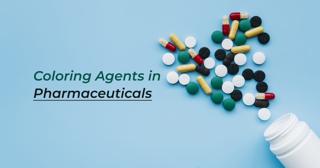
Pharmaceutical colors are widely used as a food color additive to impart desirable color to products, including syrup, tablets, capsules, and more. The primary purpose of adding pharmaceutical colors is to enhance the visual appearance of products and make them more appealing to consumers’ eyes. However, it is vital to make the right color selection when it comes to pharmaceutical colors, colorants, or coloring agents.
All right! In this blog post, you will learn what pharmaceutical colors are and how to choose the right one to suit your unique business needs. Businesses today need to emphasize trust, color consistency, and reliability. Choosing the right food colors for pharmaceutical dosage forms is crucial to ensuring the perfect formulation.
It’s important to emphasize colors with different shades of blue, green, and white while considering specific drug types, target audiences, and brand identity can help ensure consistency throughout the process.
Whether you’re a business or an individual entrepreneur wondering how to choose the right pharmaceutical colors or colorants for pharmaceutical dosage forms, continue reading this blog further.
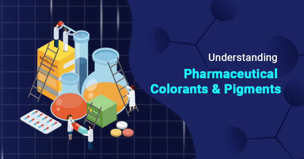
What Are Pharmaceutical Colors?
Pharmaceutical colors, colorants, or coloring agents are color additives that provide different colors to various pharmaceutical products, including syrups, tablets, capsules, and more. White, Blue, Green, and Red are examples of pharmaceutical colors used in the industry.
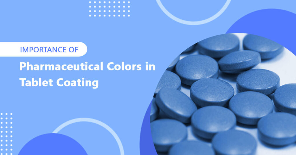
Importance of Pharmaceutical Colors
The importance of pharmaceutical colors in table coating and various other medical dosage forms can’t be overstated. Increased appearance, color consistency, and enhanced palatable value of the product are some of the top reasons businesses need to consider.
Coloring pharmaceutical drugs is more than just improving the visual appearance, but also plays a great role in increasing brand identity, patient compliance, and product differentiation. Therefore, selecting the right colorants and staying on top of color trends in cosmetics and pharmaceuticals will benefit your product’s success, as well as the satisfaction of your customers.
Here are some of the top reasons that clearly explain the importance of pharmaceutical colors:
- Color Psychology
Businesses need to consider emotional links to taste to enhance the impact of color and food pairings in pharmaceutical dosage forms. Fast-food chains approbate the color red following the yellow and orange colors. It gives a feeling of being famished, especially when someone sees a yellow or orange color.
White is most commonly used as a base color, which symbolizes sterility, purity, and cleanliness. On the other hand, red color is linked to passion and energy. Organic, natural, and eco-friendly food shows a good connection to green and earthy tones. These colors with different hues attract consumers in many ways.
- Packaging and Branding
Packaging for food products has the advantage of entrancing up memories and emotions, so use it to achieve strong emotional connections with consumers. Ensure that the packaging color matches the flavor of products whenever possible, creating strong branding.
Generally, you have only 1-2 seconds when your product is displayed on the retail shelf, regardless of whether it is edible or cosmetic. Therefore, it is important to accentuate flavor aesthetically to bring out the senses as far as possible.
- FDA Regulations
This is the most important thing to consider when it comes to choosing the right pharmaceutical colors for medical dosage forms. Ensure the color is regulated and permitted by the authorized regulatory bodies, such as the U.S. FDA, EFSA, and FSSAI. Regulatory agencies follow stringent safety protocols and quality control to ensure the products match their guidelines and are safe to use before approval.
For example, The FDA regulates the use of color additives or coloring agents in pharmaceuticals, foods, and cosmetics to ensure product safety and efficacy. Additionally, EFSA (European Food Safety Authority) and Food Safety and Standards Authority of India (FSSAI) also evaluate food colors for safety.
- Drug Type
Businesses need to consider drug types when choosing the right pharmaceutical colors for their drug or cosmetic products. For example, red or blue with dark shades are used to convey the message of strength, power, and relief.
Likewise, red color is used to symbolize heart health in cardiovascular drugs. In addition to this, light blue or green is best suitable for soothing effects in allergy medications.
- Target audience
There’s a great psychology behind color selection based on different factors, including age type. Elderly people are more likely to be attracted to soft, muted colors for greater visibility.
On the other hand, younger generations tend to like more vibrant, brighter colors. So, it’s important to think about your target audience and make the color selection accordingly.
- Consistency and Accessibility
It’s important to consider color conscience across all marketing materials such as packaging, websites, and advertising. This will also help in branding and marketing your products to the target audience more efficiently.
Make sure there is enough contrast when people with visual impairments need to read your colors.
Conclusion
the selection of the right pharmaceutical colors is not only important for visual appearance but also plays a crucial role in establishing a solid brand identity, building trust, and retaining customers like never before. Consider all these factors when selecting colors for pharmaceutical dosage forms to ensure quality, efficacy, and branding among your target audiences across the globe.
If you are still wondering how to choose the right colorants for your industrial applications, including foods, drugs, or cosmetics, look no further Hridhan Chem Pvt Ltd. Hridhan Chem is a reputable manufacturer and exporter of premium quality pharmaceutical colors and pigments used in cosmetics, drugs, and foods.
FAQs
Red, white, blue, green, yellow, or brown are some of the most commonly used colorants in pharmaceuticals. Pharmaceutical color manufacturers leverage both natural and synthetically derived color substances to obtain a suitable formulation.
Generally, white color symbolizes purity and hygiene, thus giving clients a sense of security in business cases. While green indicates growth, nature, balance, and refreshment: pharmaceutical and healthcare organizations that emphasize natural, organic living are more likely to be in good health.